Capital One · 2026
From layout to code without noise
H1 · Serif · max 2 linesCapital One's Velocity premium card page, from its components to the documentation that carried every detail into code.
Subtitle · 1–2 lines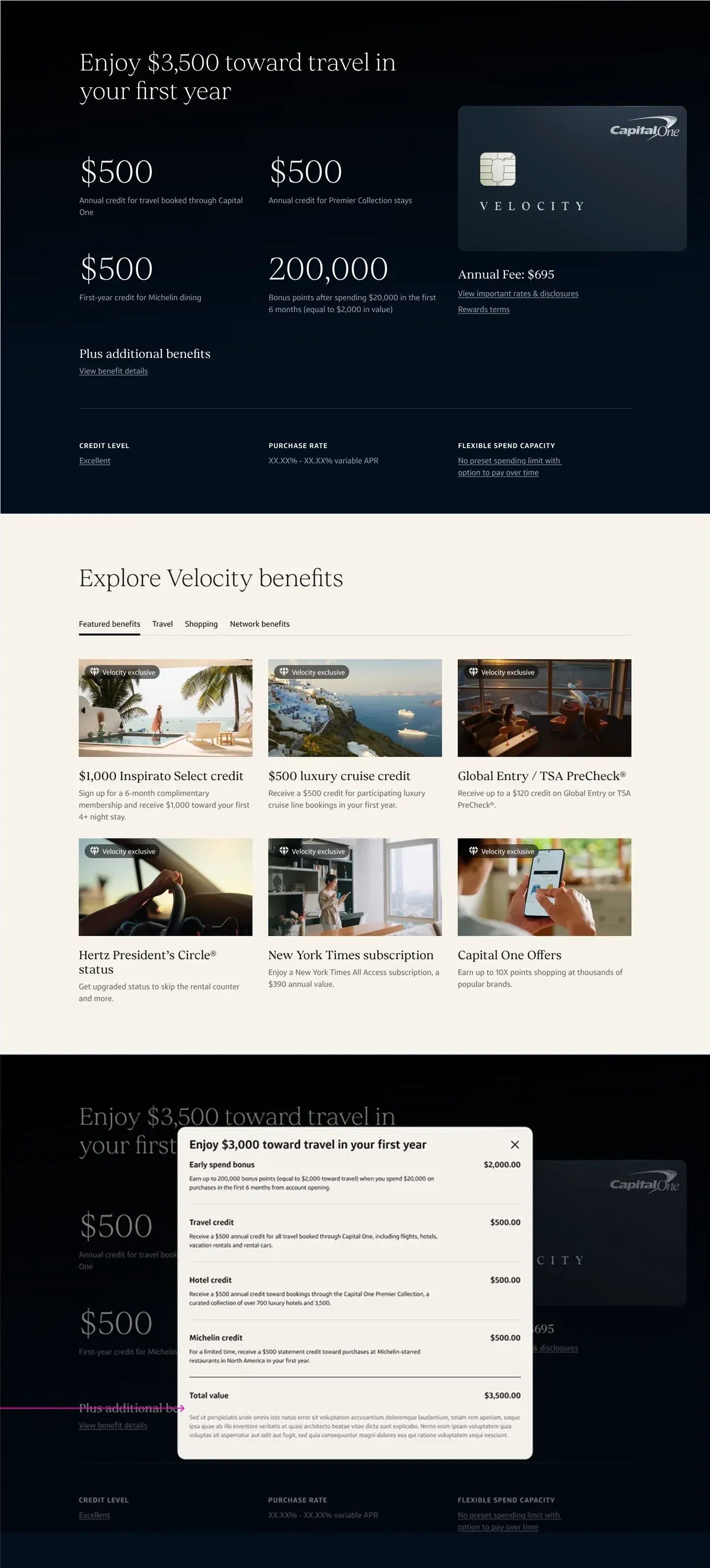
- Client
- Capital One
- Role
- Product designer · handoff documentation
- Timeline
- Jun – Sep 20264 months
- Tools
- Figma
In 30 seconds
- The problem
- Take a premium page from Figma to code without losing detail, while the design was still evolving.
- The delivery
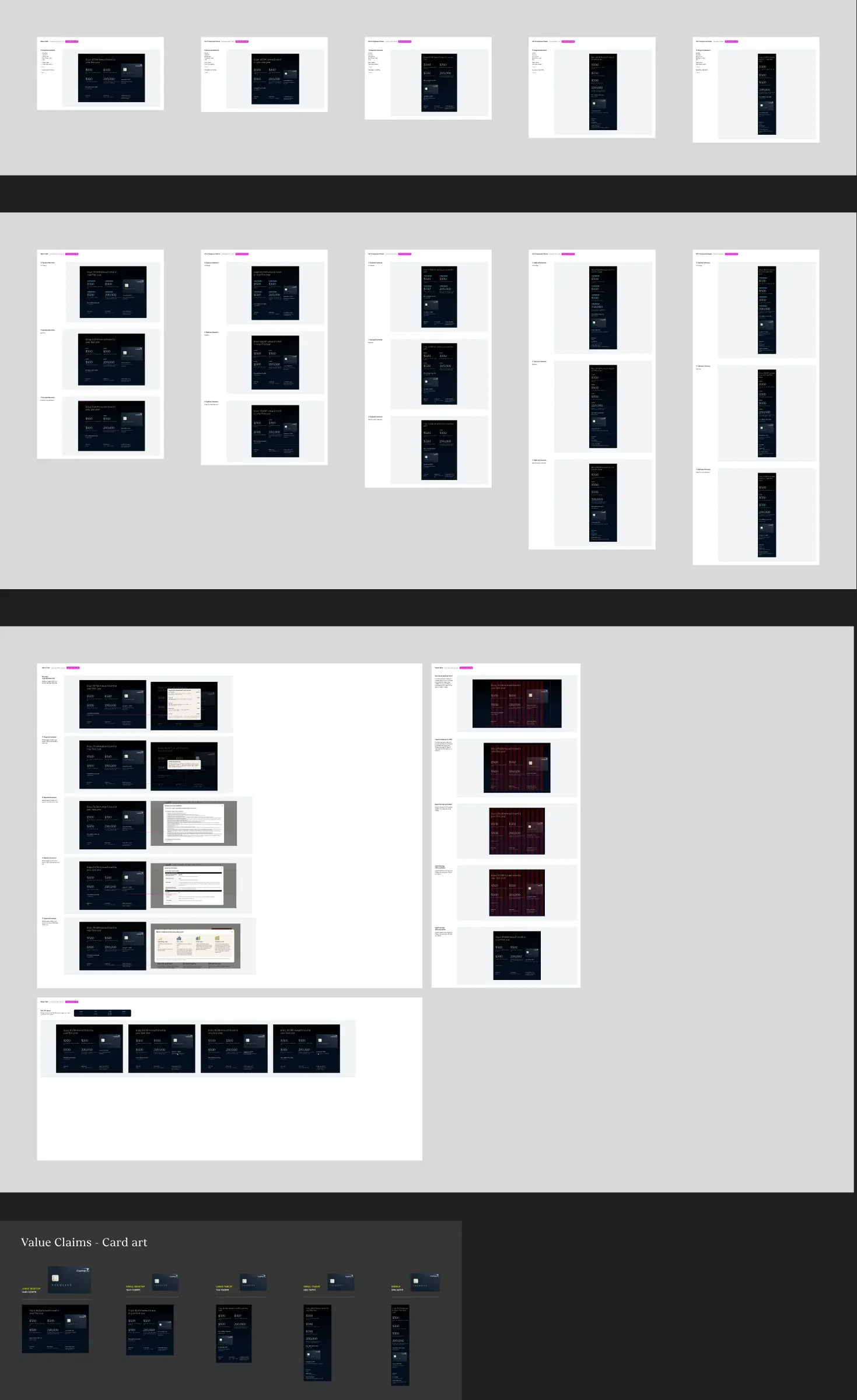
- 16 components designed and documented across 5 breakpoints, with answers for the development team.
- The outcome
- 7 deliveries in 10 weeks, at the development pace and with the premium design preserved.
- 16components documented
- 5breakpoints per component
- 7deliveries in 10 weeks
Context
A premium card needs a page to match: serif typography, deep blue and restrained motion. Luxury lives in the details, and details are what gets lost most often between Figma and code.
The Velocity benefits page has its own visual language, but it is built on Xmod, the bank's library of marketing modules, which in turn is built on Gravity, Capital One's design system.
Challenge
Take a page with its own visual language, built on the bank's library, from Figma to code without losing a single detail: 16 components, 5 breakpoints and a design that kept evolving during development.
Process
From exploration to delivery
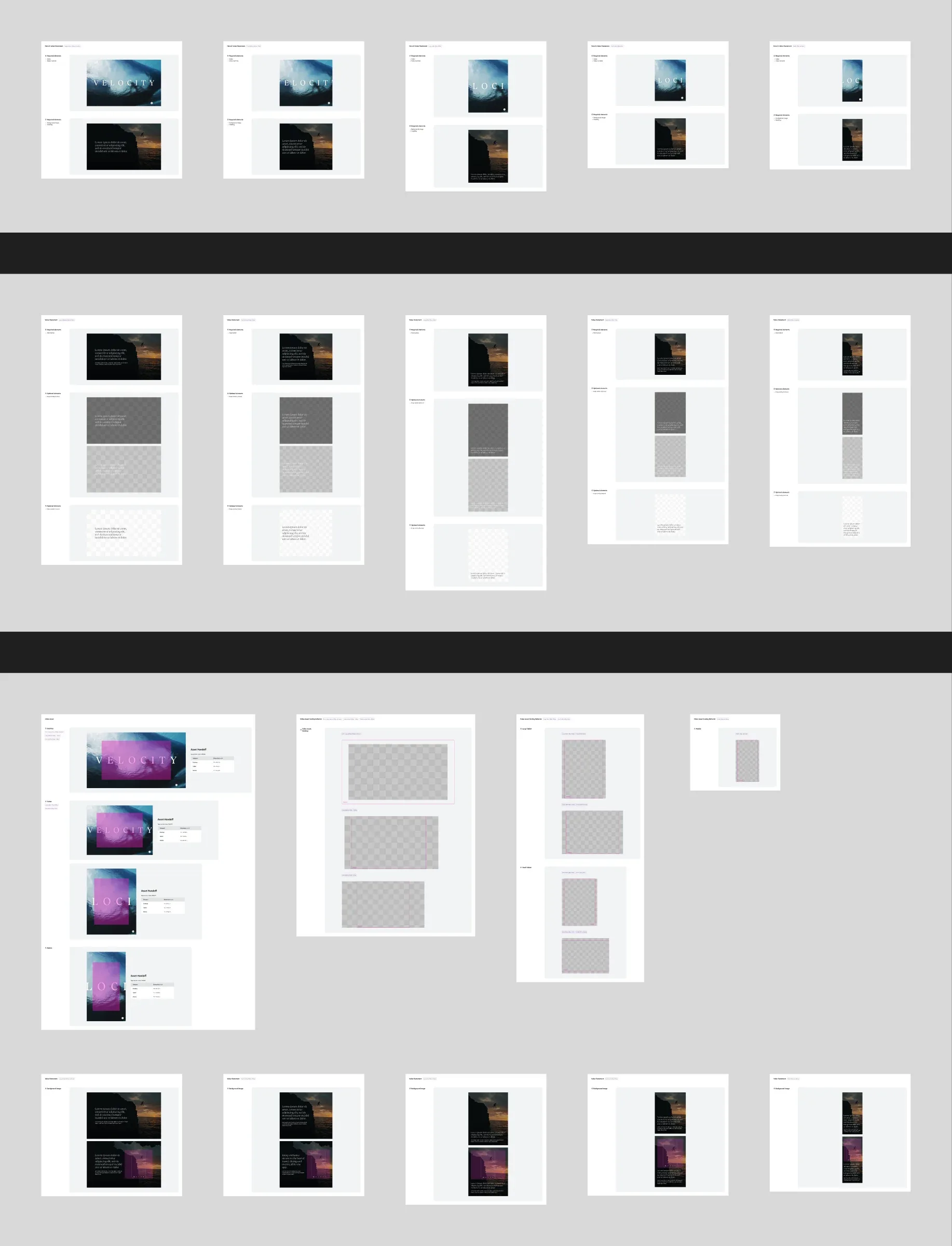
The work started with exploration: motion storyboards for the hero and component variations that helped settle the page's language.
With the language defined, the focus shifted to making sure it reached code intact: each of the page's 16 components got its own handoff documentation, in 7 deliveries over 10 weeks.
Delivery cadence
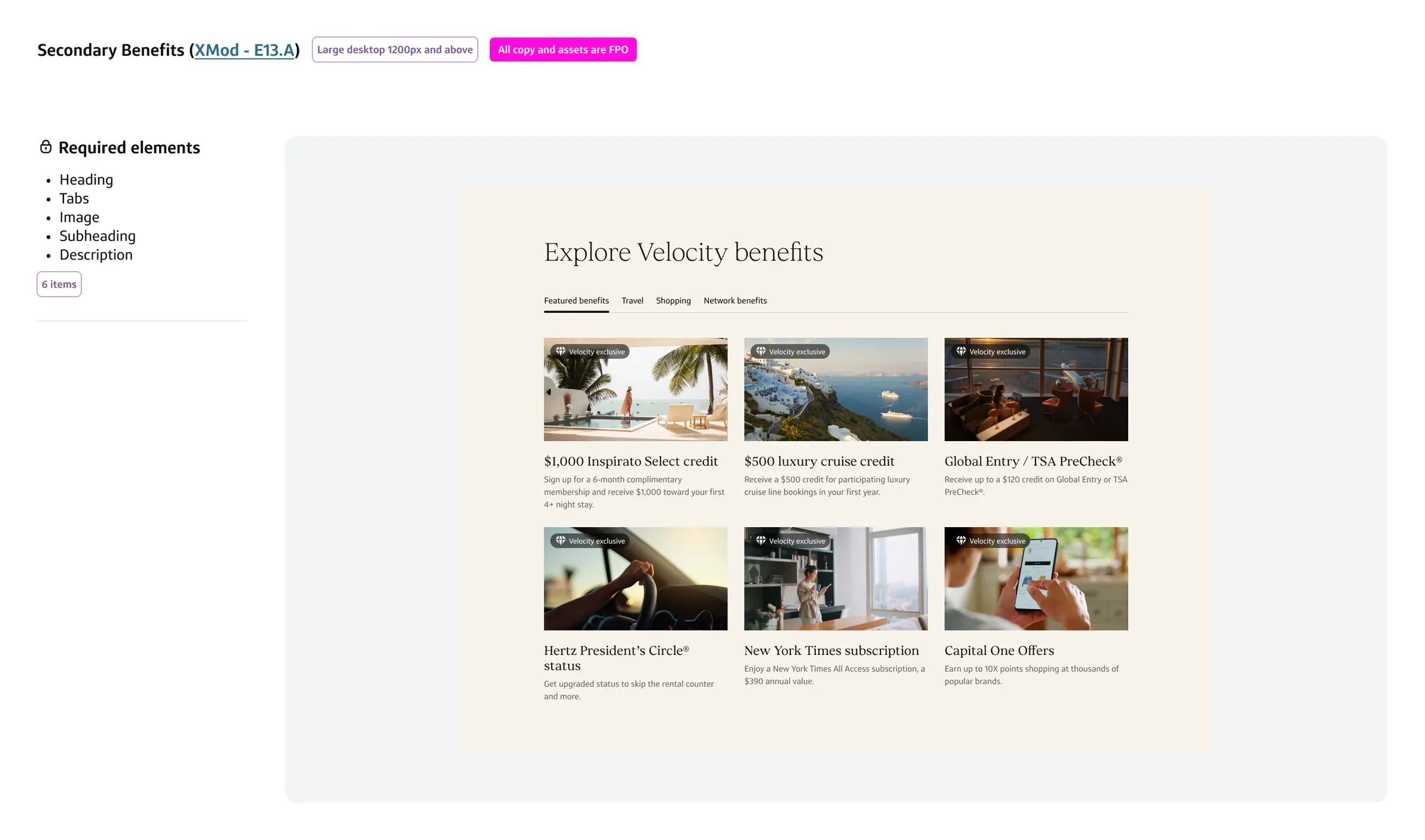
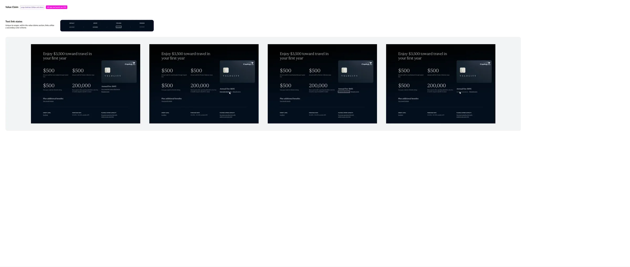
Seven packages in ten weeks, at a pace that kept up with the development team. Beyond the components, page-wide patterns were documented too: badges, logo scaling, buttons and links.
- Handoff 1 · Jul 17Secondary benefits, Earn rates
- Handoff 2 · Jul 22Value claim, Premier collection
- Handoff 3.1 · Jul 31Cross promo CTA, Rates and fees, Disclosures
- Handoff 3.2 · Aug 07Tertiary benefits, Sticky nav
- Handoff 4 · Aug 28Lounge, Dining & Entertainment
- Handoff 5 · Sep 17App
- Handoff 6 · Sep 28Closing statement, Hero & Value statement
Solution
Answers before the questions
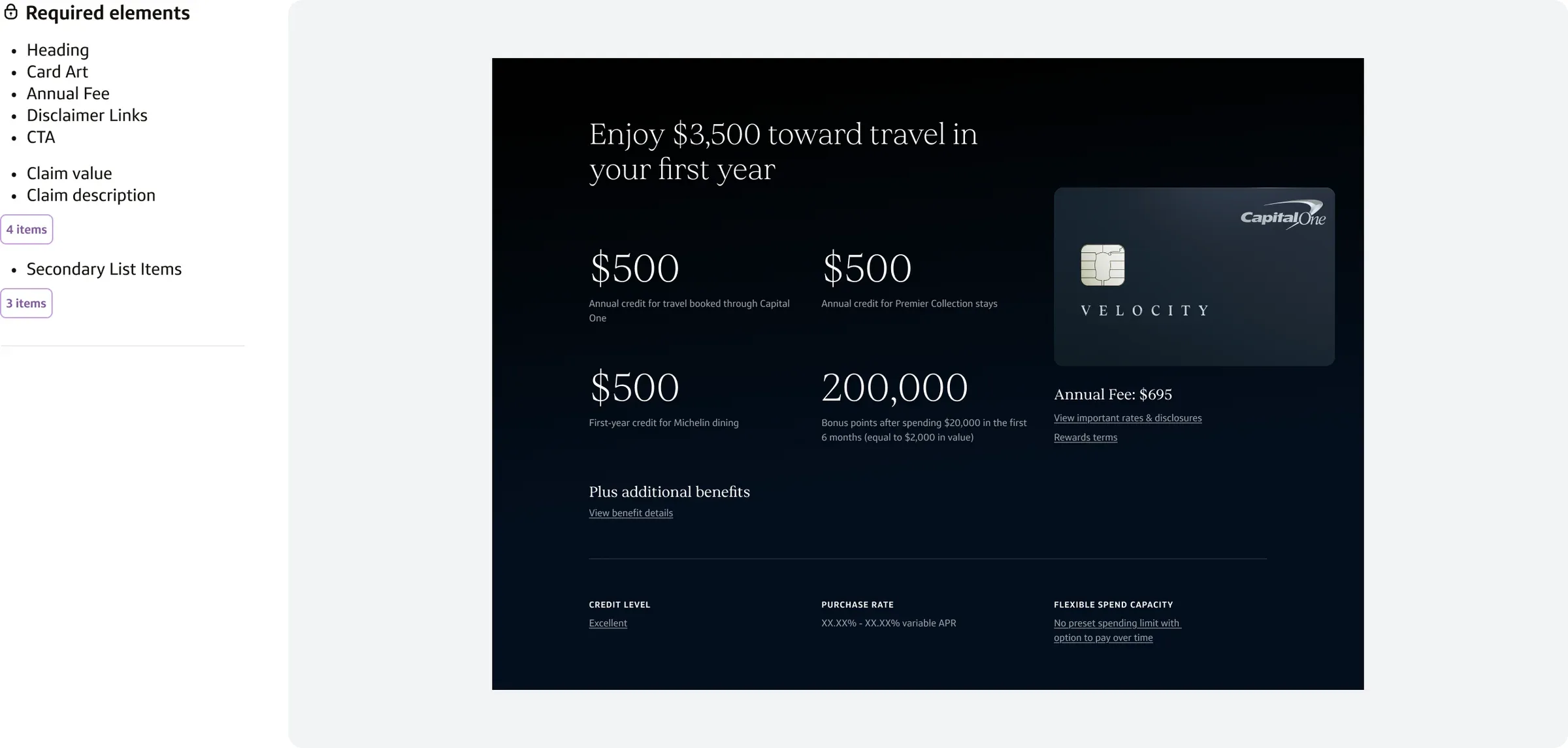
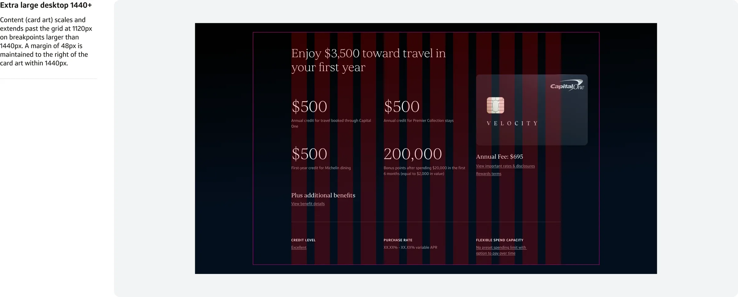
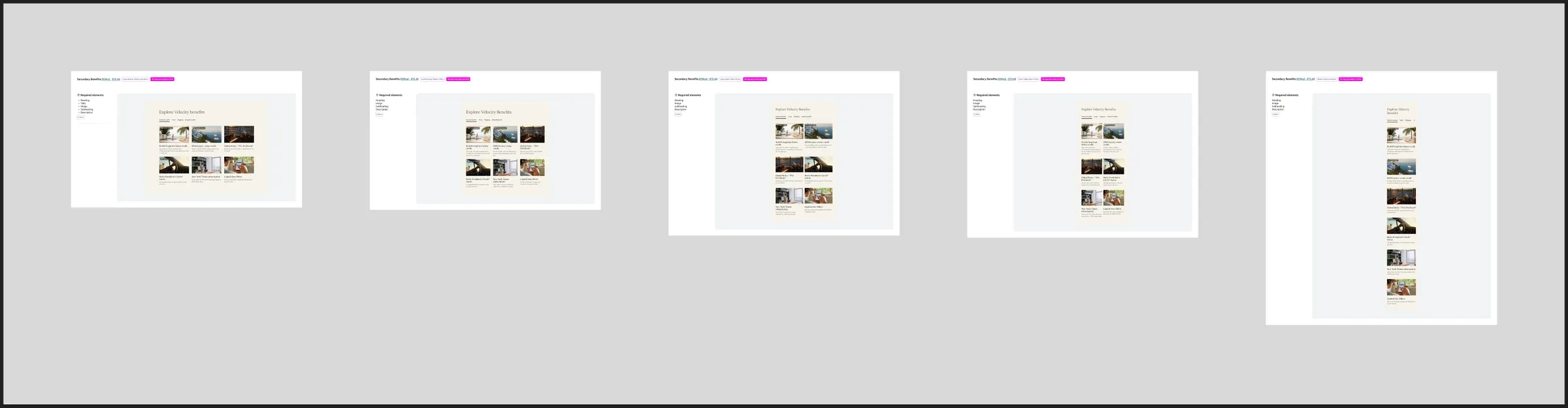
Every component was documented across 5 breakpoints: from large desktop to small desktop, through the intermediate tablet resolutions, down to mobile. Some came from Xmod, adapted to the premium tone; others were created from scratch. The documentation answered the development team's questions before they came up:
How many characters fit in a highlight?
≤ ~7 chars · 64pxWhen should a description truncate?
max 4 lines → …How many columns does the headline span?
8 colsHow does the card art scale?
< 1200px → scaleWhere is italic allowed?
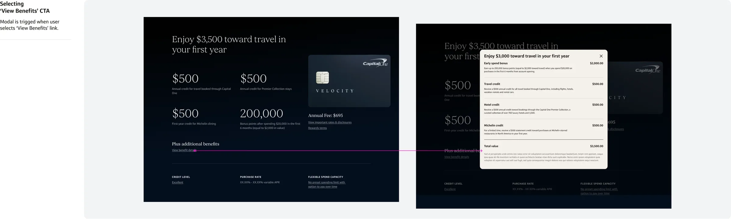
italic: selected wordsWhat happens when each link is clicked?
→ Behavior
When the design changed, the documentation changed with it, with dated update notes inside the component itself.
The handoff file