Tulipas Joalheria · Oct 2025 – Jan 2026
Decades of tradition in a new presence
Rebranding Tulipas Joalheria, a family-owned jewelry brand from southern Brazil with stores in Passo Fundo, Esteio and Rolante.
- Client
- Tulipas Joalheria
- Role
- Brand designer · strategy, identity and applications
- Timeline
- Oct 2025 – Jan 20264 months
- Tools
- Figma
- Gemini
In 30 seconds
- The problem
- A premium jeweler with nearly five decades of history and an identity that fell short of its jewelry.
- The delivery
- A complete visual identity, from symbol to palette, from packaging to the storefront concept.
- The outcome
- A brand with the presence of a jewel, already in customers' hands on the produced bags.
Context
Tulipas was started by a mother, passed on to her daughter and, over nearly five decades, became a reference in fine jewelry in the interior of Rio Grande do Sul.
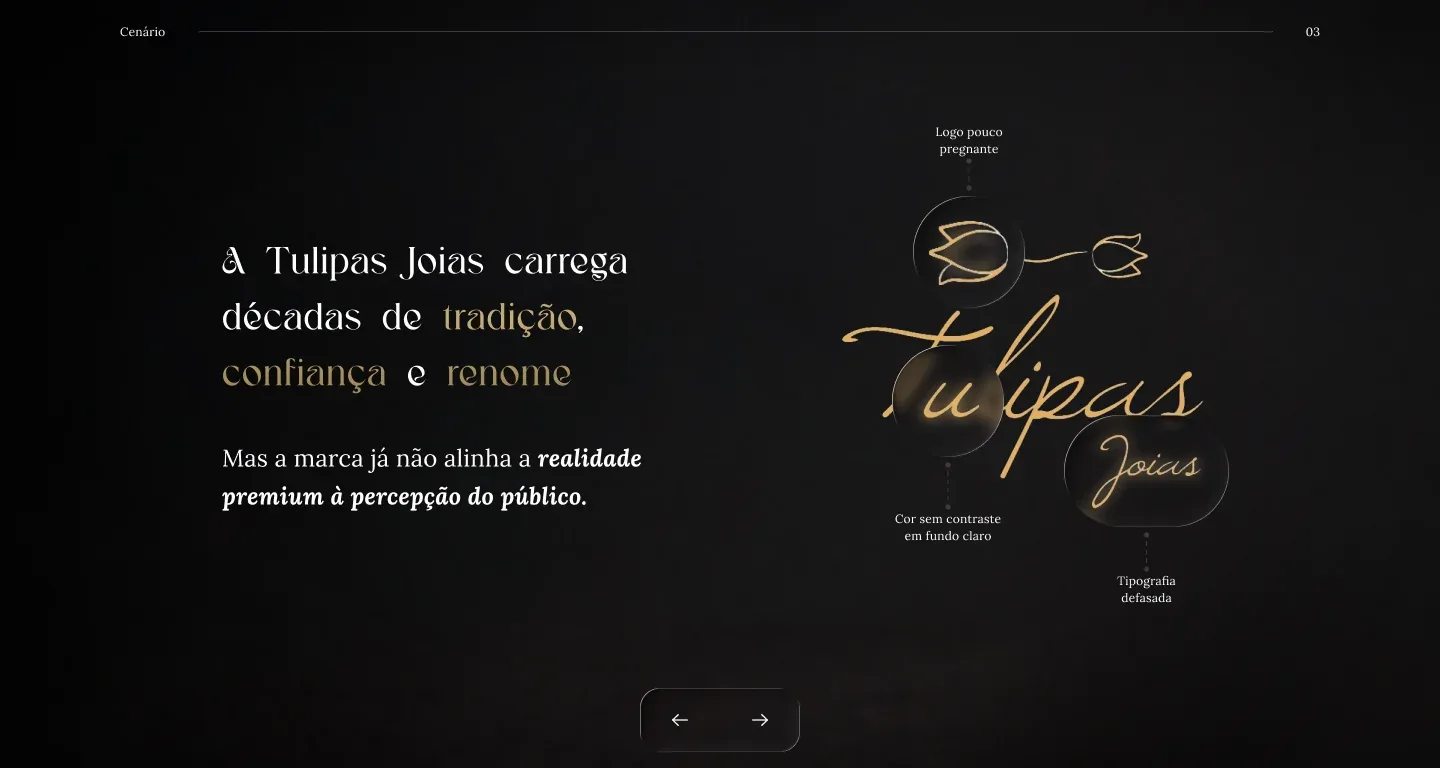
The identity, however, had fallen behind: a hard-to-read cursive lettering, with no contrast, that didn't reflect the quality of the pieces.
The reality was premium. The perception wasn't.
Challenge
Build an identity worthy of the jewelry across every brand touchpoint, from storefront to packaging, from the counter to digital, without losing the elegance built over nearly five decades.
Process
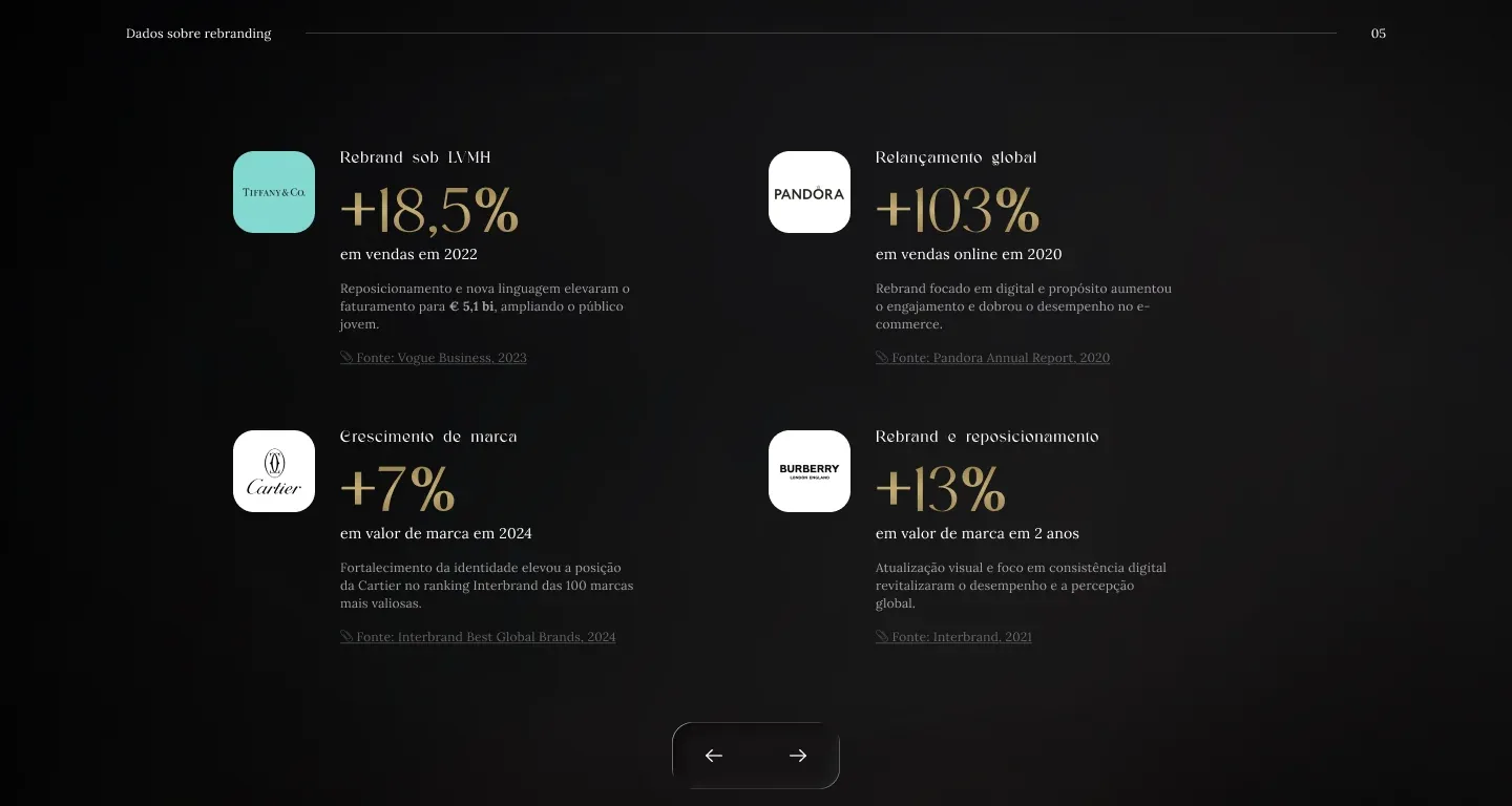
Before the first stroke came the argument: a diagnosis of the old brand, a benchmark of the world's leading jewelers and data from rebrands such as Tiffany, Pandora and Cartier.
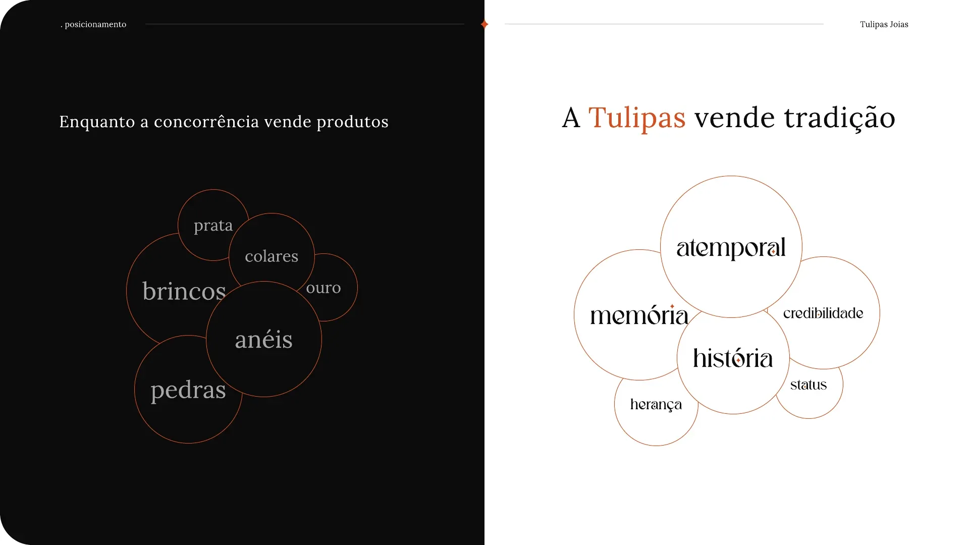
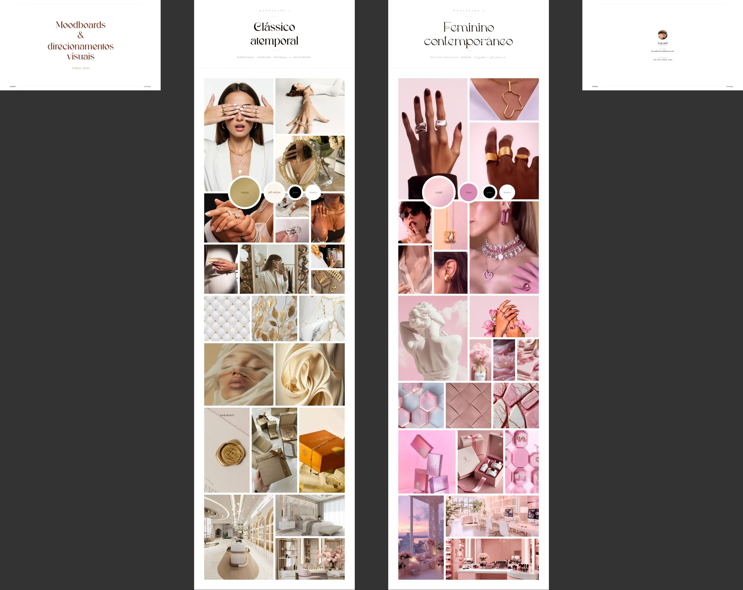
From it came the strategy: keywords, a persona and a simple positioning that guided every decision from then on.
- Luxury
- Tradition
- Sophistication
- Timeless
- Self-esteem
- Trust
- Brilliance
While competitors sell products,Tulipas sells tradition.
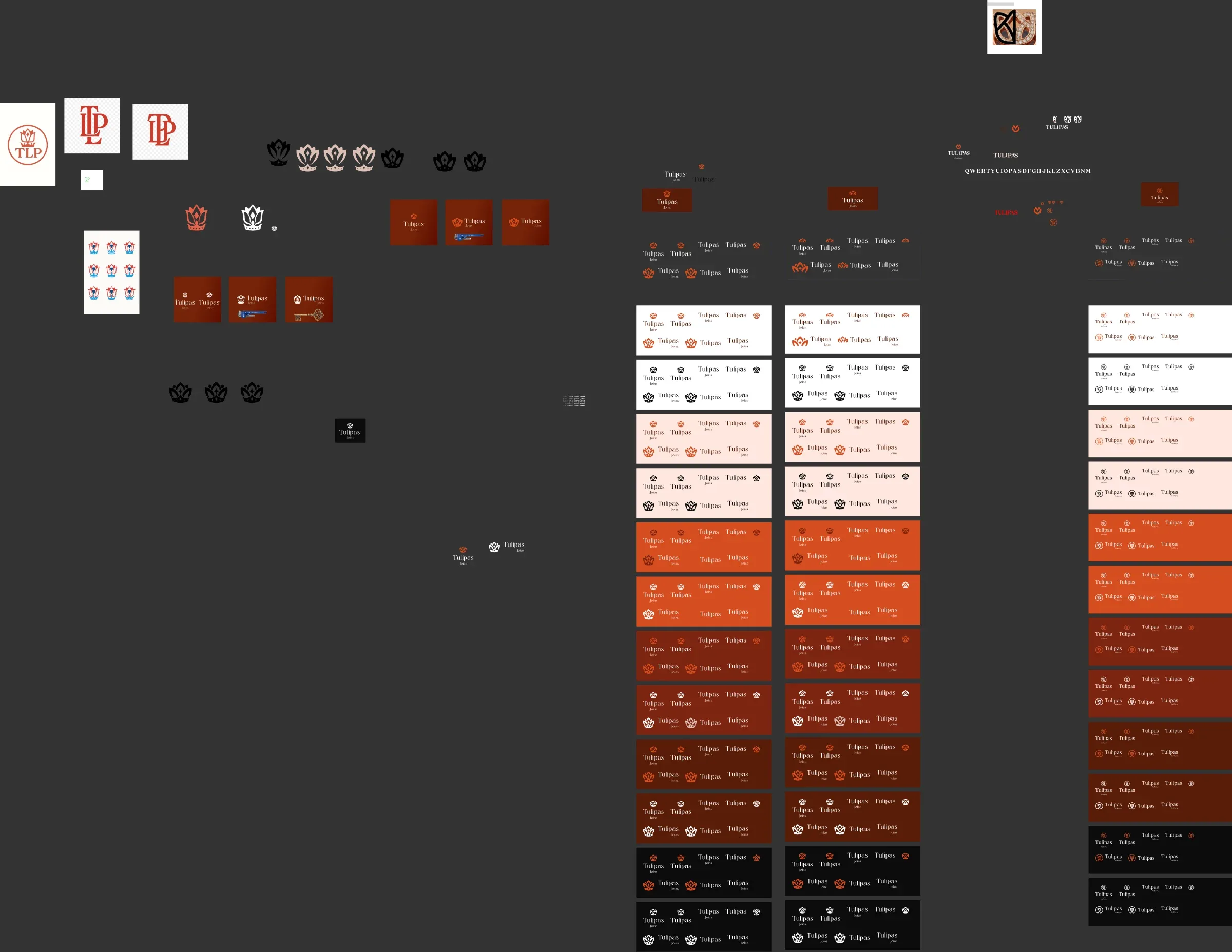
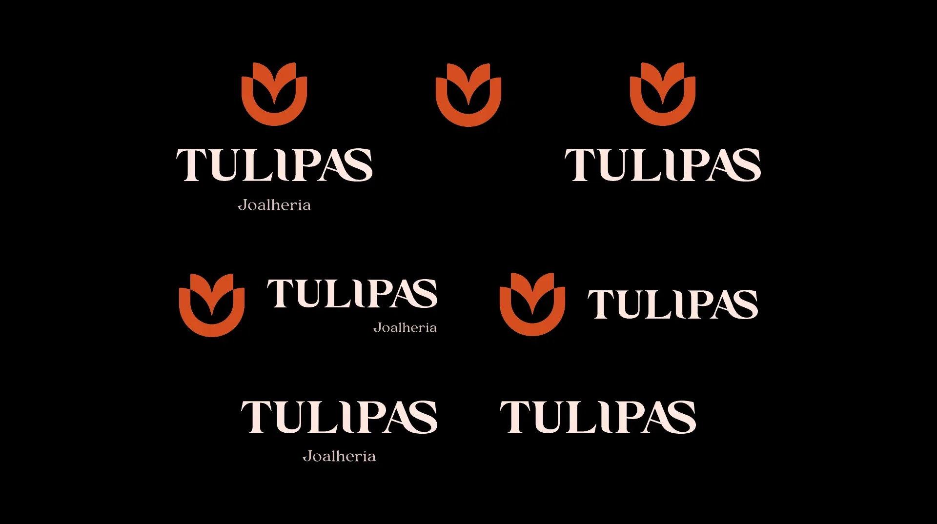
Like a jewel, the brand was cut and polished over and over: countless tests of shape, proportion and color until it reached the geometric tulip, solid as a seal, with the name in capitals and a ligature joining the L and the I.
From afar, it commands the storefront. Up close, it keeps the delicacy of a handmade piece.
Solution
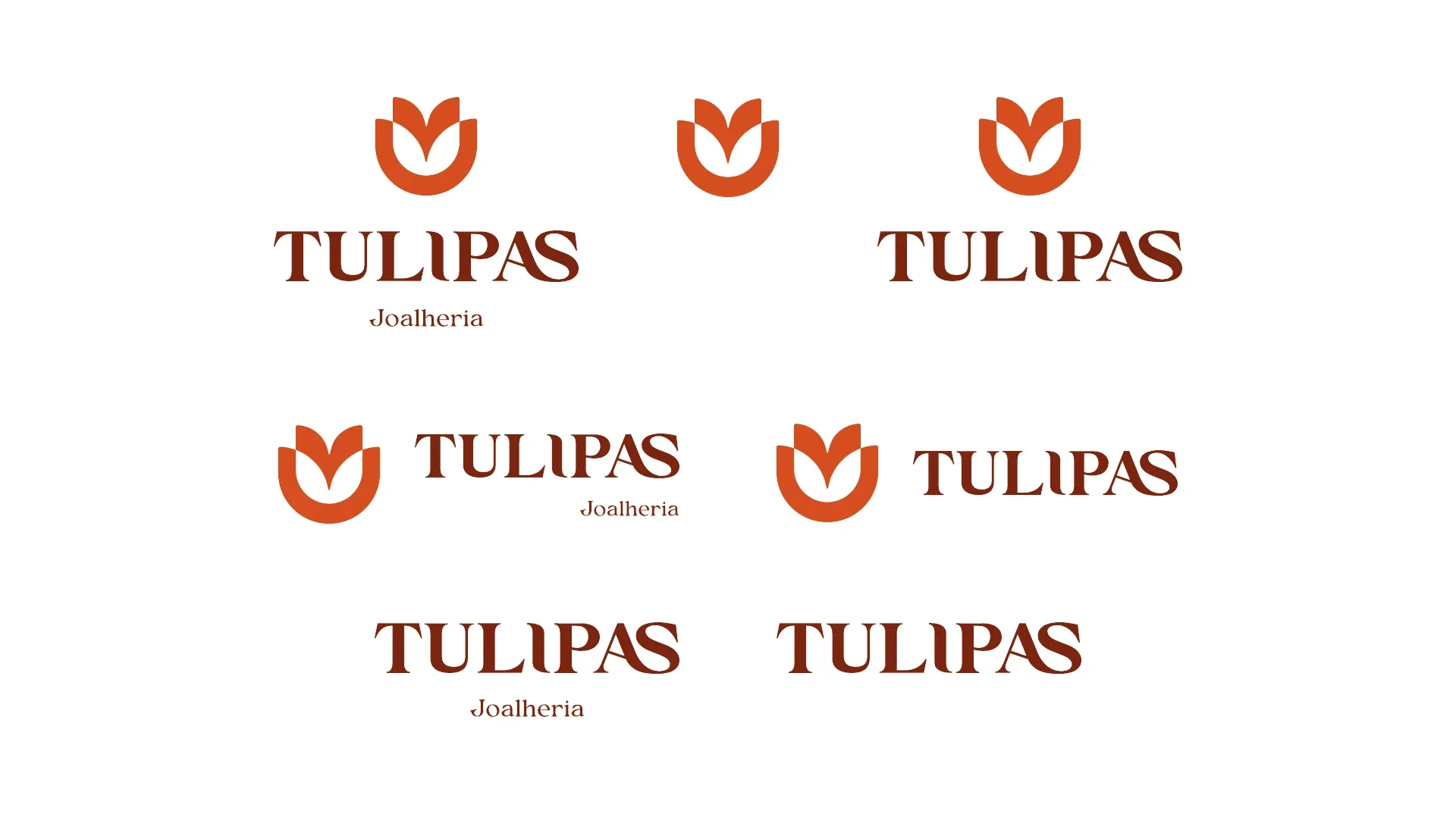
The tulip unfolds into a complete identity: the logo in 8 variants and 5 color versions, a palette that runs from terracotta to cocoa and nude, and typography that pairs strong headings with light, graceful text.
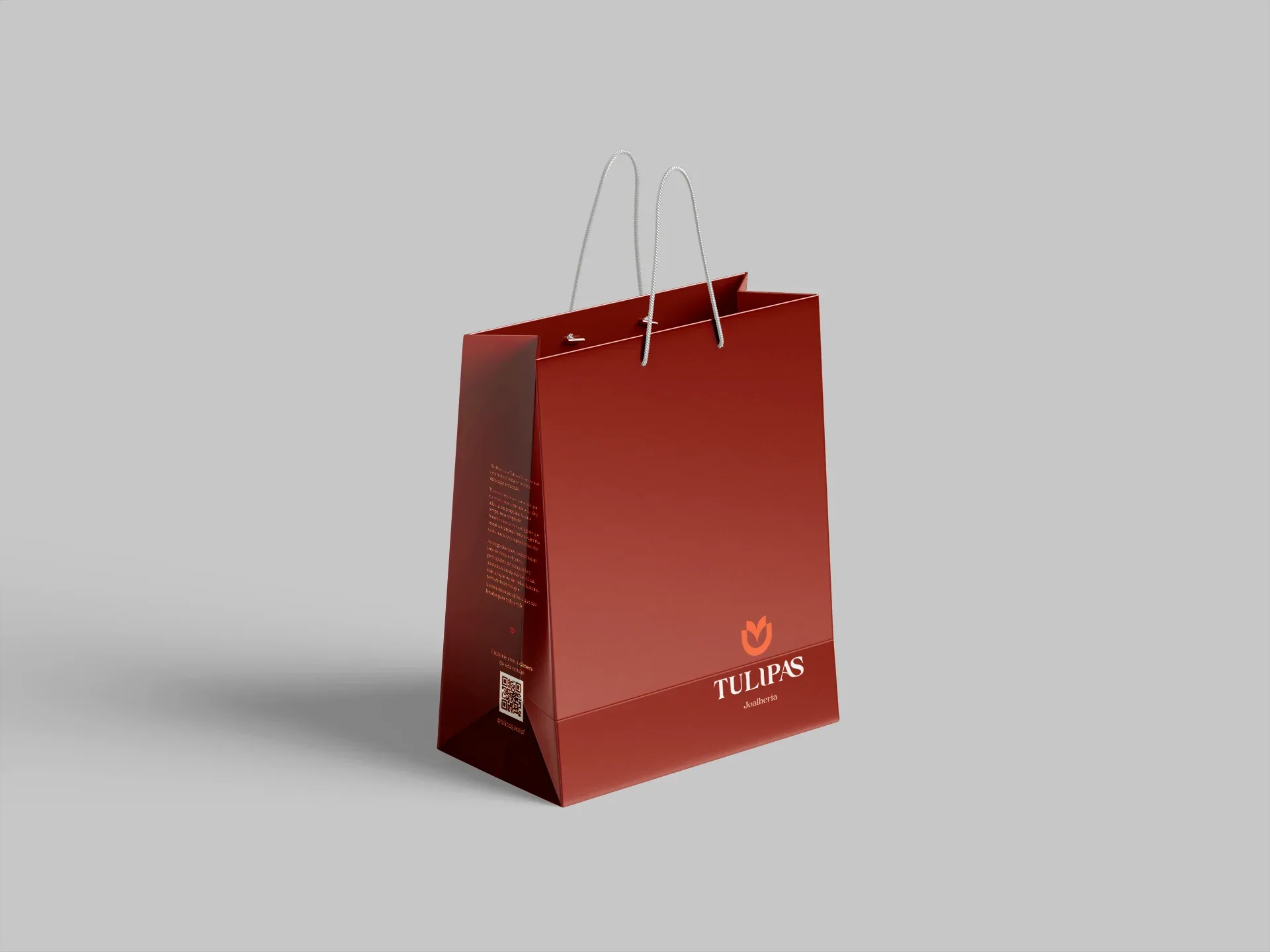
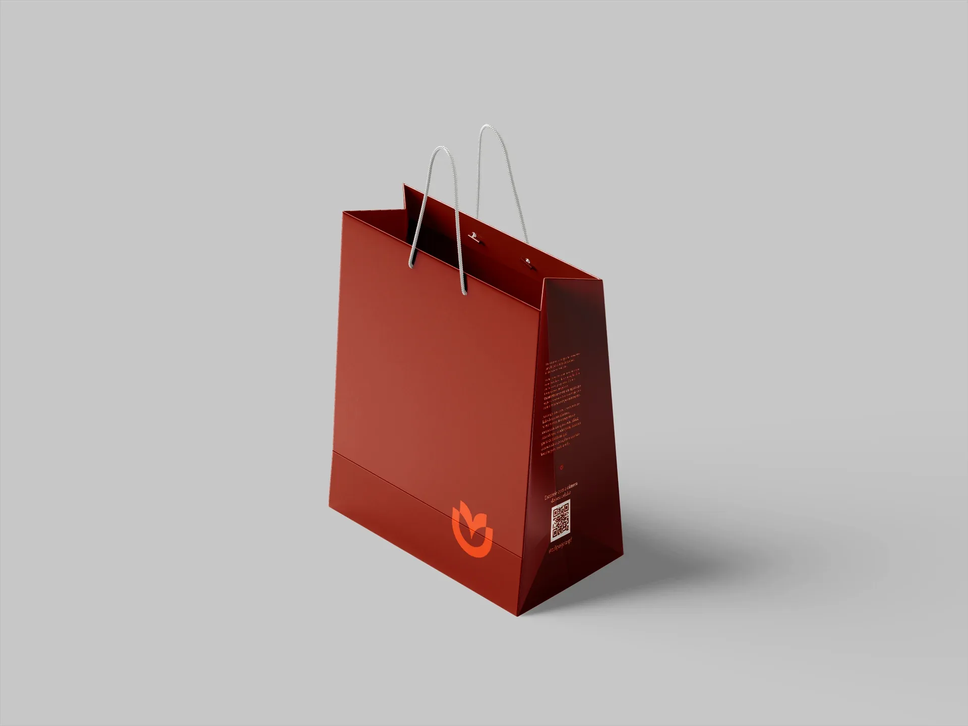
Every piece was designed to carry the same presence wherever the brand appears, from the shop window to the bag in customers' hands.
- Terracotta#D64D20Pantone 7580 C
- Cocoa#581C08Pantone 483 C
- Off-white#FEE7DEPantone 705 C
- Nude#DAC0B6Pantone 4755 C
Regalia Monarch · Headings
Aa Bb Cc
jewels that span generations
Lora · Text
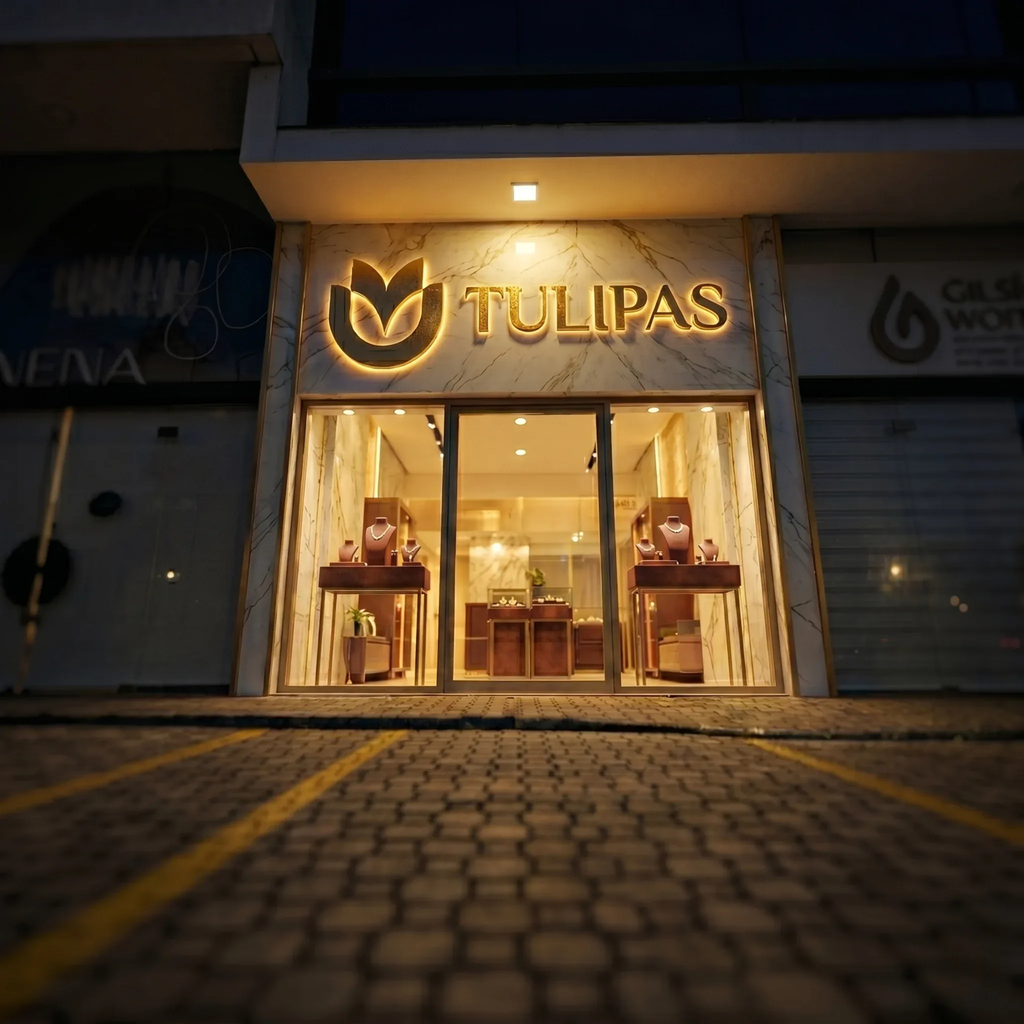 Concept
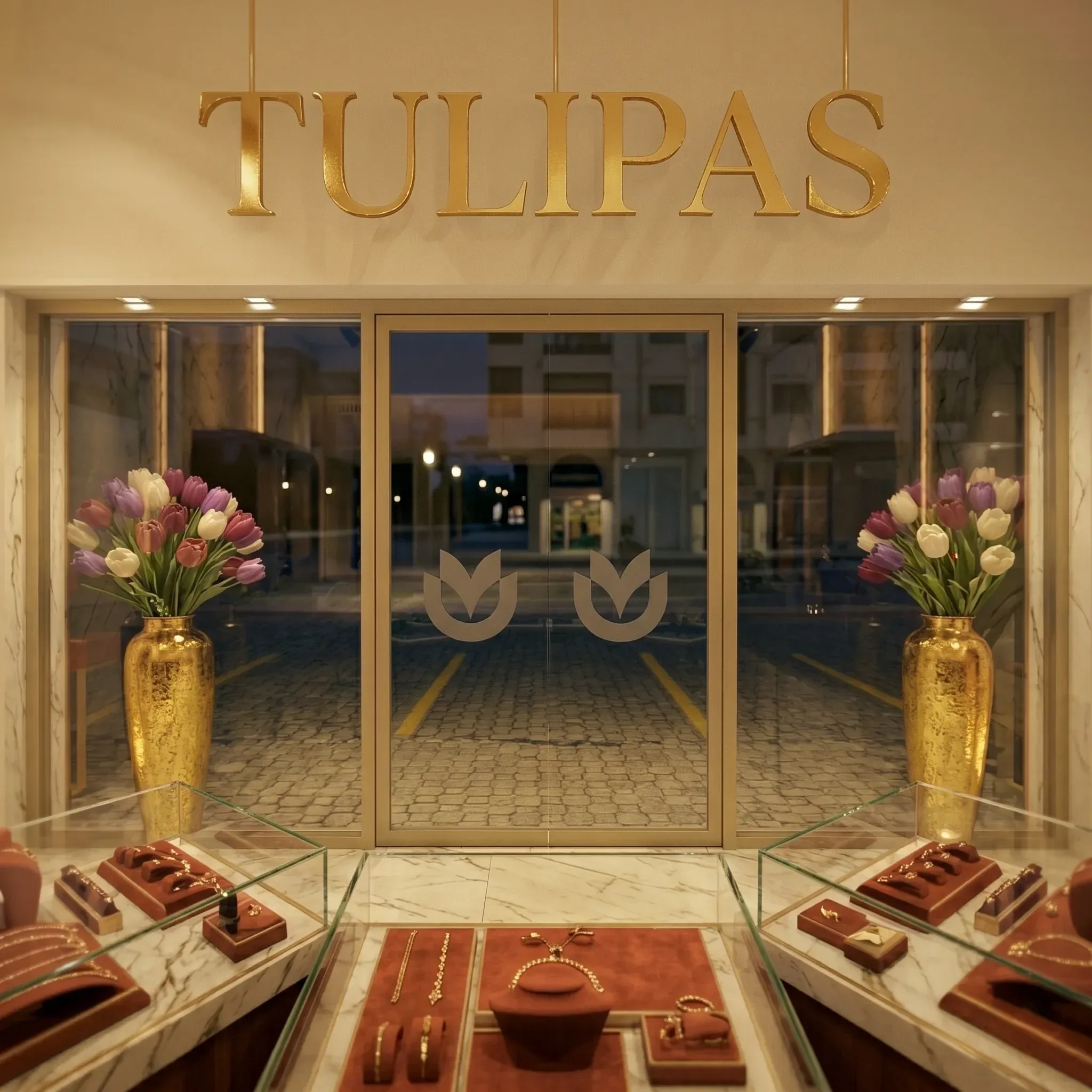 Concept
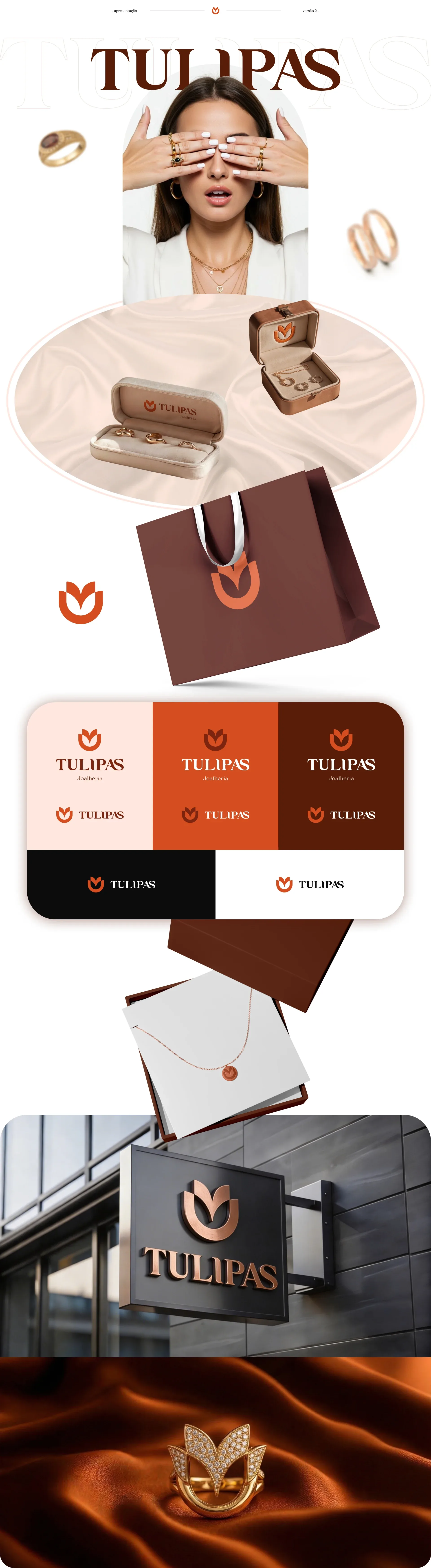
- 8logo variants
- 5color versions
- 4colors with Pantone references